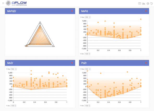
In materials science it is important predict the phase stability for a system. The realization of stable phases identifies which structures are best for synthesis, thus accelerating the discovery of novel materials. To preform this analysis particular type of visualization known as a phase diagram are created. In general, a phase diagram is constructed by plotting the formation enthapies vs. composition for each structure and calculating the convex hull -- the set of most extreme or "outside" points.
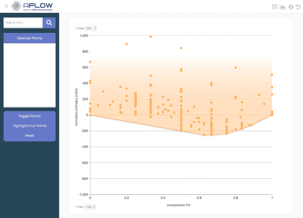
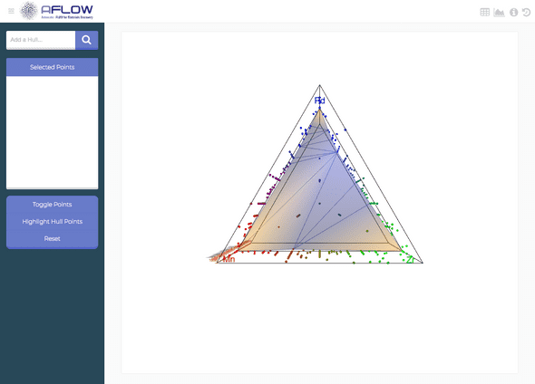
In this project, I was tasked with developing a web application to visualize the phase diagrams for binary and ternary systems within the AFLOW database. The AFLOW database contains over 1.8 million structures spanning over 90 different atomic species. This results in 4,819 binary hulls and 92,274 ternary hulls, each of which containing 200-1000 structures. Furthermore, depending on the system size, this requires two different types of visualizations. For the binary case, the phase diagram is 2D, with the convex hull being a path connecting the "outside" points. While for ternary systems, the phase diagram is plotted on a 3D triangular grid, where the convex hull becomes a complex multi-faced plane.
Live site and GitHub repo:
Backend
The objective of the back end is very straight forward: store the phase diagrams and send it to the frontend. Therefore, I used Flask and MongoDB to create a simple REST API consisting of three endpoints:
- hulls/{system} : Fetches a hull for a given system.
- entry/{auid}: Fetches the material entry info for a given AUID (AFLOW unique identifer).
- availability/{selection}: Gets the availability and reliability for the selected elements. This endpoint is used during searches to highlight, color and grey out elements of the periodic table depending on which system.
Frontend
Unlike the back end, the frontend was much more involved. Not only did it require two different visualizations, but it required the following features:
- Interactive visualizations with the option to select points, change axis (binary) and adjust the camera (ternary).
- The option to download the PDF report for a particular phase diagram.
- A component to view the information of any selected points.
- A component in which users may compare multiple phase diagrams.
- The ability to see selected points highlighted across all selected hulls.
- Routing, such that users can share a link for a particular phase diagram.
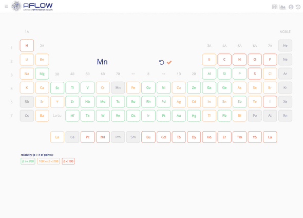
- An interactive periodic table to select the system. Depending on the selection, the elements in the table will grey out and change color depending on the reliability of that systems phase diagram.
Given the set of features I've chose to build the app using React, Redux and React Router while the visualizations where handled using D3.js for the binary phase diagrams and Three.js for the ternaries.
Periodic table search
The search interface was designed to be a periodic table where users can construct their search query by clicking on the elements in the table or typing in the search box. As elements are added to the query the elements in the table would react. If a particular combination is not present in the database the element will appeared greyed out. Additionally, available elements will change color depending on the reliability of the phase diagram. This metric corresponds to the number of structures for the given system. Red signifies systems containing less than 100 entries, yellow for systems with 100-200 entries and green for systems with 300+.
Each of the elements of the periodic table are instances of the component
{
  "Pr": {
    "reliability": 2,
    "availability": true
  },
  "Ni": {
    "reliability": 289,
    "availability": true
  },
  "Ru": {
    "reliability": 227,
    "availability": true
  },
  "Y": {
    "reliability": 229,
    "availability": true
  },
  "W": {
    "reliability": 253,
    "availability": true
  },
  "Pt": {
    "reliability": 296,
    "availability": true
  },
  ...
}
The values of reliability and availability where then passed as props to
Visualization
When a binary system is selected, the app renders the phase diagram using D3.js. Points in the plot may be selected and the bounds of the y-axis may be adjusted.
Ternary plots are rendered using Three.js. One may adjust the camera and also select points in the plot.
Structure info
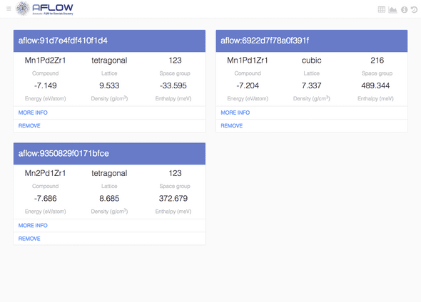
The app keeps track of all points selected. When one visits the entry component information about the selected structures are fetched from the AFLOW database and displayed as a list of cards.
Comparison
Each selected phase diagram is saved by the application and listed in this component. This is useful because one may compare phase diagrams. In addition, any selected points will highlight across all stored phase diagrams. Finally, clicking the title of any phase diagram will reload it in the visualization component, while fetching the data from the local store.
